Large homes
So what are we focused on?
Experience and personal expression. We are foodies, we love to entertain and have open space to do so. We love the outdoors and access to them. Smart homes are our norm. And of course, we are all about that insta-worthy unique photos that we can hashtag the shit outta.
Just because we don’t want a big home doesn’t mean we don’t want nice things:
We will go out of our way to pay extra for a craft beer or meet up with friends at an expensive restaurant that has a killer vibe. Those little experiences make up our lives. Same goes for our interiors. We’ll spend the extra time shopping multiple websites that house unique finds till we spot what we’re looking for. Multifunctional is a major buying factor too as those type products encompass our lives (enter in cell phone which is also a camera/gps/computer/flashlight/dating app etc.).
We love luxury bedding, state-of-the-art cook wear, smart appliances, funky side tables, cozy throw blankets, sexy sofas, eclectic ottomans, personalized accessories and gripping art.
Small spaces doesn’t = IKEA:
IKEA had it’s stay when we were in college. No offense to our faithful friend. Yes, it served a purpose and yes, its Nordic/Scandanavian style is perfect for small spaces, BUT it is not the end all and thanks to Insta hotties like Hilary & Flo, Terrace 25 and Sally Worts we are inspired to think outside the box when decorating our small spaces. Small does not equate boring or cheap.
Here are some ways you can drastically improve and personalize your small space:
Cheating space with mirrors:
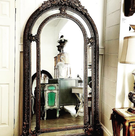
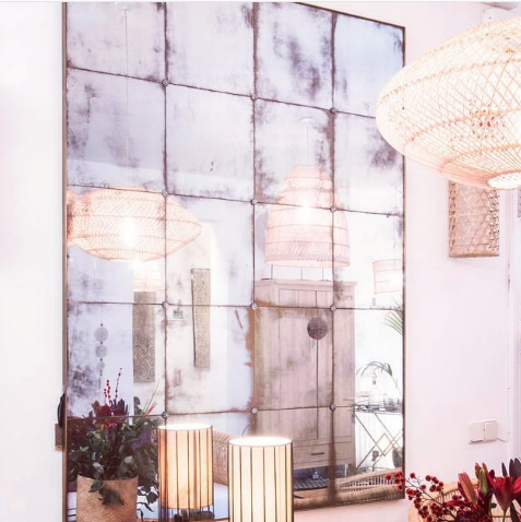
We all know mirrors help a small space feel twice it’s size. When most people hear this they think of those god-awful mirrored, sliding closet doors, but that’s not what we’re talking about. There are so many other ways you can incorporate mirrors into a design in a way that not only is functional but serves as art.
Check out these applications!
Antique or tinted mirrors give off a depth and moodiness as they enlarge your space. They feel less stark, less sterile. They are a great way to add some character to a super clean, super modern space.
Unique details on ceiling and walls:
Ceilings are the underused blank canvas! Especially for small spaces, what you choose to do with
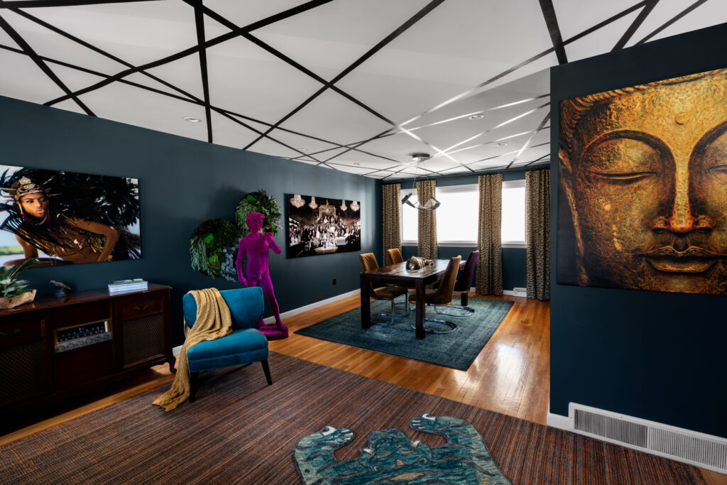
Geometric walls:
Geometric walls are super easy to do yourself and if you don’t want to go buy expensive and heavy art, it can be done cheaply and easily with paint and a well-picked color palette. It has such an amazing impact on a small space. You can easily do this with masking tape and a few hours.
Here’s an awesome example:
Another awesome look you can try is watercolor walls:
They’re so soothing and showcase furniture pieces really nicely. It’s another technique you can do on your own for a quick and powerful makeover. eHow has a great article on how to. I love wall treatments like this because they are easy to change, layer on top of mix colors to create a unique look. And again you don’t have to worry about art. Your whole wall is art.
Luxury doesn’t mean oversized: Size-conscious luxury pieces:
This is an old previous generations’ way of thinking: the bigger, the more luxurious. Before we used to aim at big couches and big chairs for bigger and bigger houses. That’s not how millennials function. We are comfortable with smaller spaces and more financial and home care freedom. This doesn’t mean we don’t like a little luxury.
Here are some examples of pieces that are small-space friendly and nothing but luxurious:
From Koket:
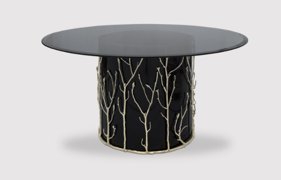
From Maison Valentina:
Picking rich color palettes:
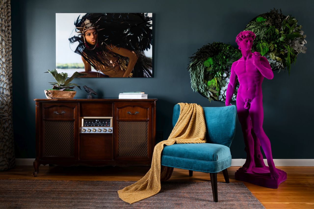
Our IKEA days had us in gray and white tones for years. It’s time to switch it up. Nothing that graduated and luxurious like a rich, bold color palette. Rich color palettes mirror the natural world and bring a level of sophistication like no other. They evoke multifaceted moodiness, depth of soul and varied experiences. Tune into colors that speak to you, then go a little deeper. It doesn’t have to be dark, just rich and full-bodied.
ART:
A lesson in picking art… don’t choose what makes sense and absolutely don’t base your decision on your color palette! It is shocking how many people (designers especially) that make these mistakes every single time.
Viewing art is about energy absorption. Let that sink in. Don’t approach art with the left side of your brain. When you do this you are limiting yourself to photography and story illustrations (the pieces that make sense). Consider dance, song or musical instruments…. Each can be performed systematically and mechanically, but the performances that really stand out are the ones where the artist put their SOUL into it. The same notes and steps are executed equally but the transference of energy from the artist is what sets the performance apart. The same goes for artwork. Artists put a plethora of emotion into their work. There is a human story being told that may have nothing to do or everything to do with the piece. If you are Left-side-brain-heavy it will be a practice of quieting yourself so the other side can step in. Have you ever sat next to someone incredibly nervous and felt uneasy yourself or saw someone smiling and it made you feel warm inside? Why is that? Nothing was done to you to cause you to feel differently but there was definitely an energy transfer. So, when standing in front of art, quiet yourself and feel. Yep, it’s as cheesy as all that. If you feel nothing then move on until something pricks you in a way that is familiar and welcomed.

This is the only way to choose art that will bring a space to LIFE. Staying within the parameters of what makes sense and what matches our color palette will instantly deaden the room.
Making a statement in your space requires you to stretch beyond safe decisions, tap into what sparks your excitement and go for it without explanation or making excuses.


