It shouldn’t come as a shock that a poorly designed place of business is bad for business. It is the equivalent of trying to make a sale in your boxer briefs. clearly something is missing!
But it goes beyond just having a space that looks good in photos or to impress clients. The performance of your employees at all levels is deeply affected by the look, feel, energy, and intuitiveness of the space you create for them. Their long term happiness, motivation, and ultimately, their tenure depends on how they feel at work.
When you are asking people to spend eight hours of their day (or more!), five days a week in the same space, how the space makes them feel will ultimately be a big factor in how they feel about their work and the company overall. Though it may seem like a minor detail, the psychological implications of commercial design run deep and should be a high priority and focus for a top performing team and long term success.
Let’s take a look at a few examples…
What do you feel when you see these offices? Are you inspired?
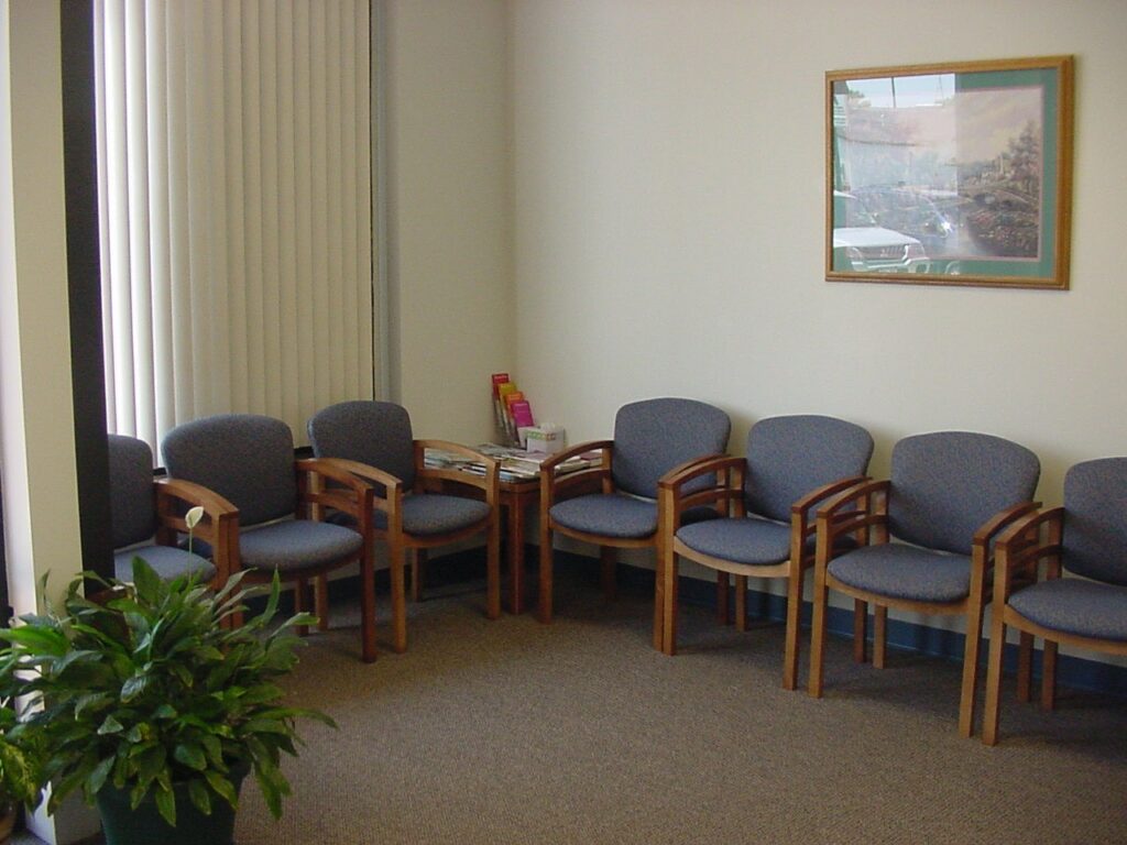
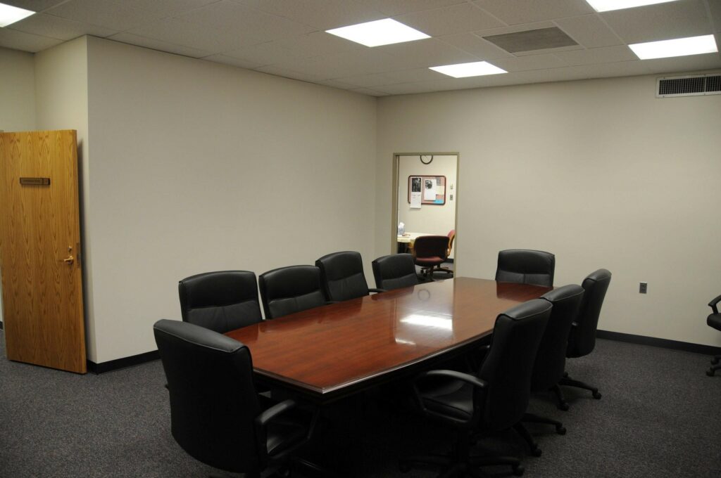
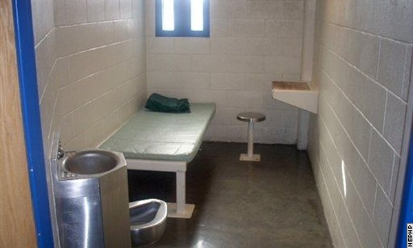
A joke and mind trick, the last picture is of a prison cell but, from a design perspective, it fits right in! Your brain almost recognizes this as one of these spaces which is really quite jarring. These spaces create fatigue and boredom and unintentionally show a lack of professional depth. They inherently show that the company has put minimal effort and time into creating a comfortable and likeable space. Now, in a day where everything is so visual, this even shows a lack of competence and forward movement.
It’s not just bad for employees, it’s bad for company image as a whole; the perception of forward movement isn’t there.
On the other hand, a company that does have a well designed workspace creates trust and motivation within both their clientele and their employees.
Let me give you some examples of little things that make a huge difference…
Did you know that curved edges set people at ease while angular edges provoke fear? Our primal programming taught us that in nature angles typically meant something was sharp or dangerous like thorns and antlers while curves create a sense of safety and flow. These curved reception desks are the perfect first impression as they are approachable in the way they soothe anxieties and dissolve skepticism. Something approachable to our psyche is an ideal start to any business relationship.
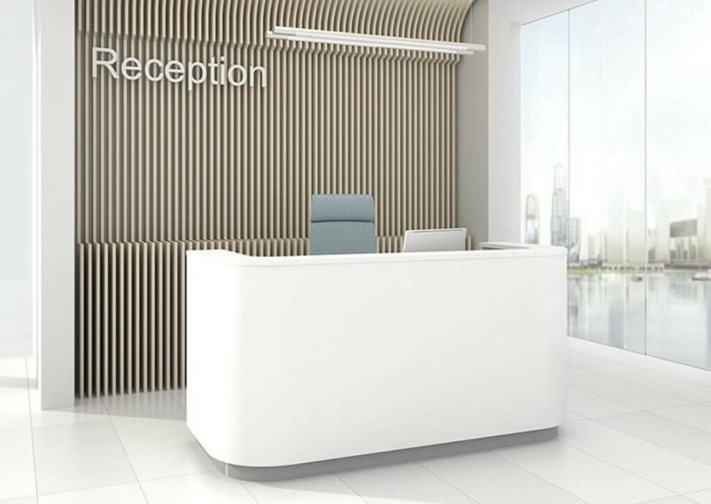
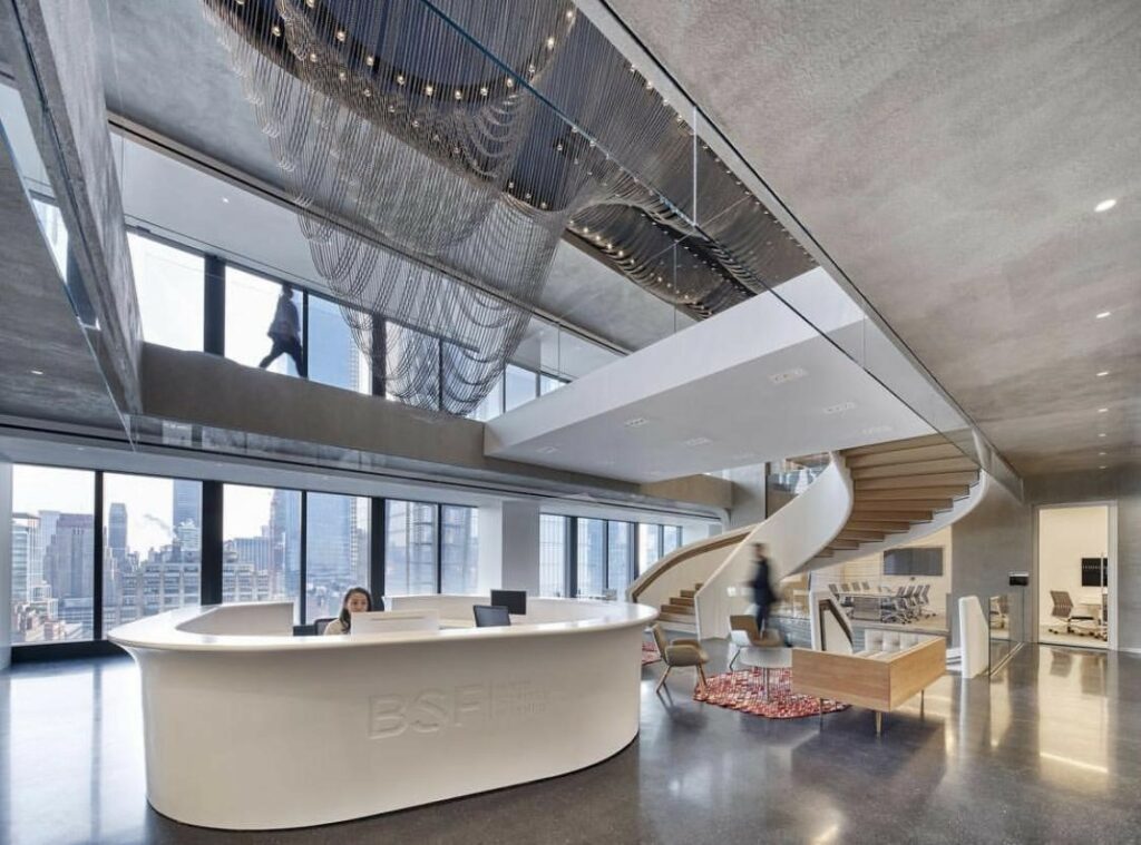
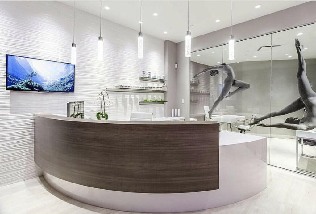
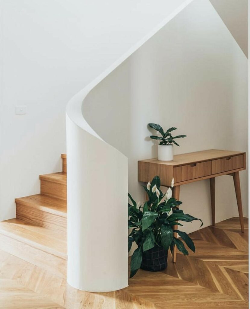
Even something as simple as a curved banister can calm nerves and bring joy. When clients feel safe, it’s easier for the relationship to grow from a place of mutual collaboration and when employees feel at ease, they are team players and are more creative at problem solving.
And what about when you want to elevate your employees productivity? Let’s talk about intrigue.
Intrigue is what brings people back for more. It excites them, promoting health and energy within your company. As a company pushing forward and trying to keep up, you want your employees to be always questioning, learning, and presenting something new. Many people think that’s only for creative businesses and tech but you don’t need to have a creative business to bring in creative design that inspires innovation.
Innovation and creativity are vital to the success of any company.
The workspace of a paper company does not need to look like a box of paper! Using color and texture to mirror the natural world, full of life and adventure, can inspire employees to push beyond the bare minimum and create a more open space communication wise between employees. This kind of design inspires workers to be more alert, confident and friendly… all characteristics of a healthy work environment.
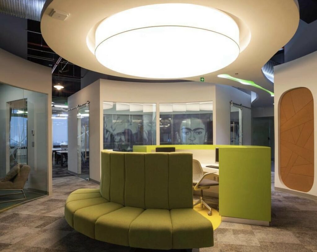
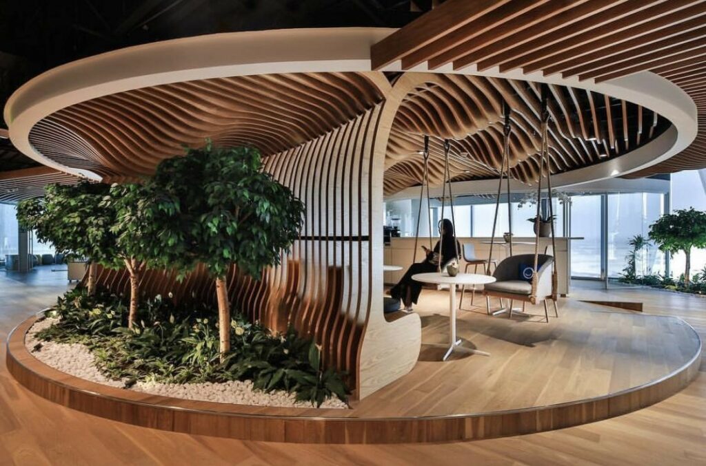
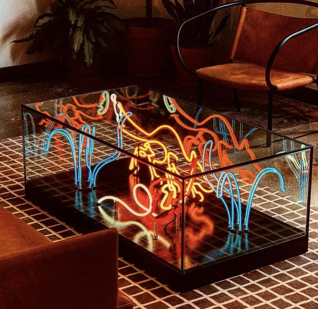
An office that is designed with these elements in mind shows leadership, attention to detail, and respect for even the smallest of concerns, therefore building trust and a perception of excellence.
Notice how here at FATHOM we bring in rich colors that evoke groundedness and intriguing art to promote curiosity and thinking outside the box.
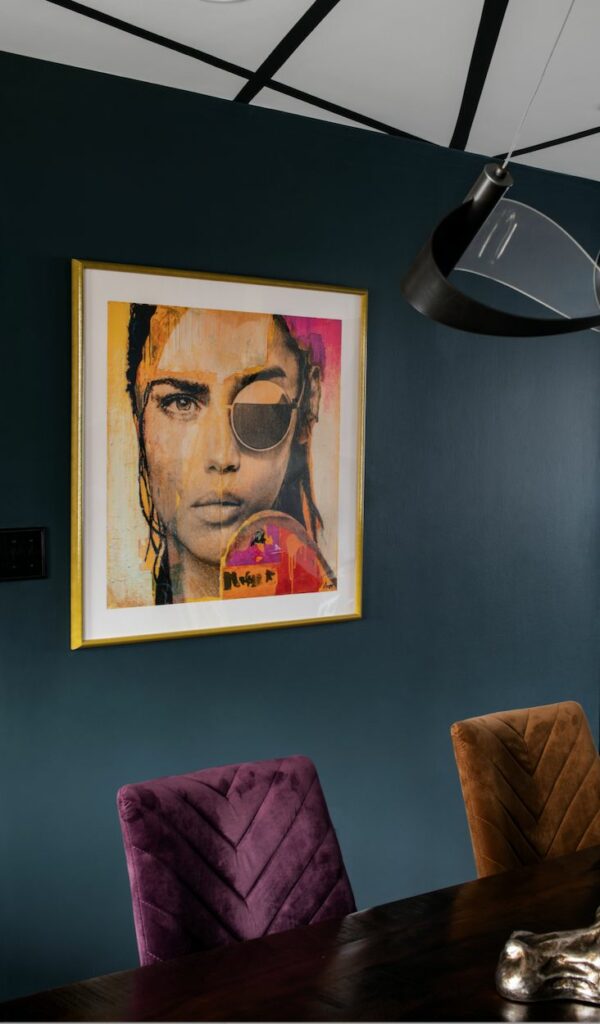
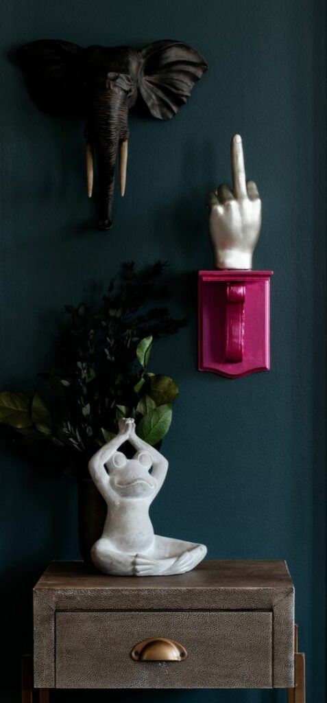
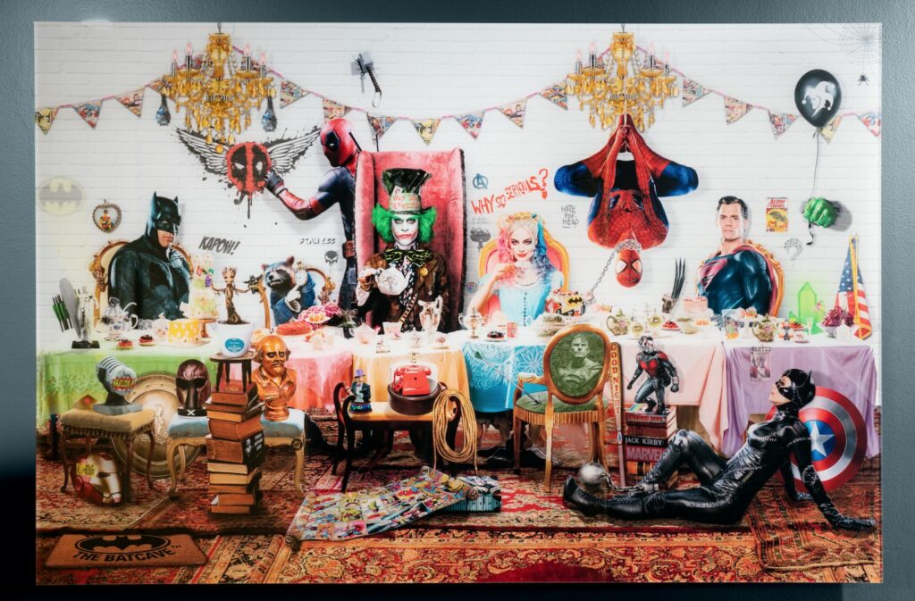
You can’t talk about the psychology of design without color, especially for commercial offices. Let’s explore color a little more…
Simply put, color is a sign of life while the lack of it is a sign of dormancy.
Now, you tell me which way to lean when creating a vibrant work environment? We associate color with confetti (excitement), flowers (appreciation), sunshine (joy), youth (creative imagination) and we associate the lack of color (white, beige, gray) with prisons (depression), hospital rooms (anxiety), nursing homes (fatigue) and schools (boredom). I strongly encourage businesses to stay away from the typical, boring beige or solely neutral color. Pops of color go a long way to breathing new life into your business!
Also, pay attention to the natural elements surrounding your place of business.
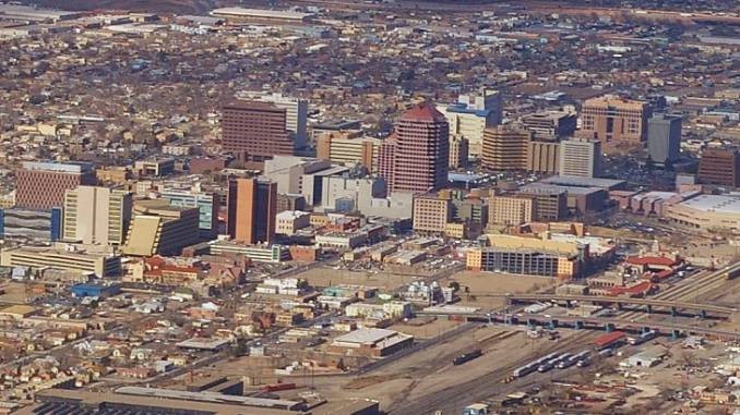
Why is it, in the desert, all the buildings are brown?
As if there isn’t enough of that surrounding you in the vast terrain! You want your company to stand out and draw people in. Choosing bright colors amidst continuous brown depicts bold vitality. Now, while Oregon is much greener than the dessert, it is also cloudy most of the year so bringing in colors of sunshine goes a long way to boost morale and productivity. Same goes for adding greenery in NYC, the concrete jungle! This balance creates harmony with your business’s surroundings and therefore harmony among employees and clientele.
Lastly, hopefully it is clear that bringing in a designer is an absolute must for the success of your business, but also, have them back in periodically to change things up now and then. Simple, inexpensive changes such as moving the artwork around, rearranging furniture and changing the wall color is so visually stimulating it enhances work ethic as opposed to seeing the same things every single day and making for a stagnant work environment.
Contact Fathom Design for a consultation to discover how we can quickly and uniquely change your work environment.
